Marvel is a web based platform that allows designers, students, startups or anyone that can bring their interface ideas to life in just a few clicks. Marvel is known to have multiple features; prototyping, wire-framing, as well as developer hand-off.
Before we began to tackle the problem, we decided to organize our thoughts and create a calendar to ensure we complete the project on time within the two week timeframe.
Conducted a Feature/Competitive Analysis of major design apps: Figma and InVision in order to compare the commenting, sharing and collaboration features between the three.
This would help us see what Marvel is missing and how it can improve.
We then conducted a SWOT Analysis to understand Marvel's Strengths, Weaknesses, Opportunities and Threats.
This would help us organize Marvels, strengths and how we can use opportunities to improve the weaknesses and understand who are direct competitors are.
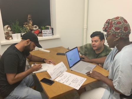
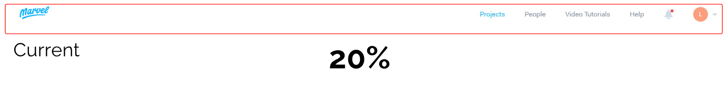
We wanted to test the Current Marvel App, to understand how different types of users interact with it.
10 Users, task completed on Current Marvel App:
1. Leave a Comment
2. Add a Collaborator


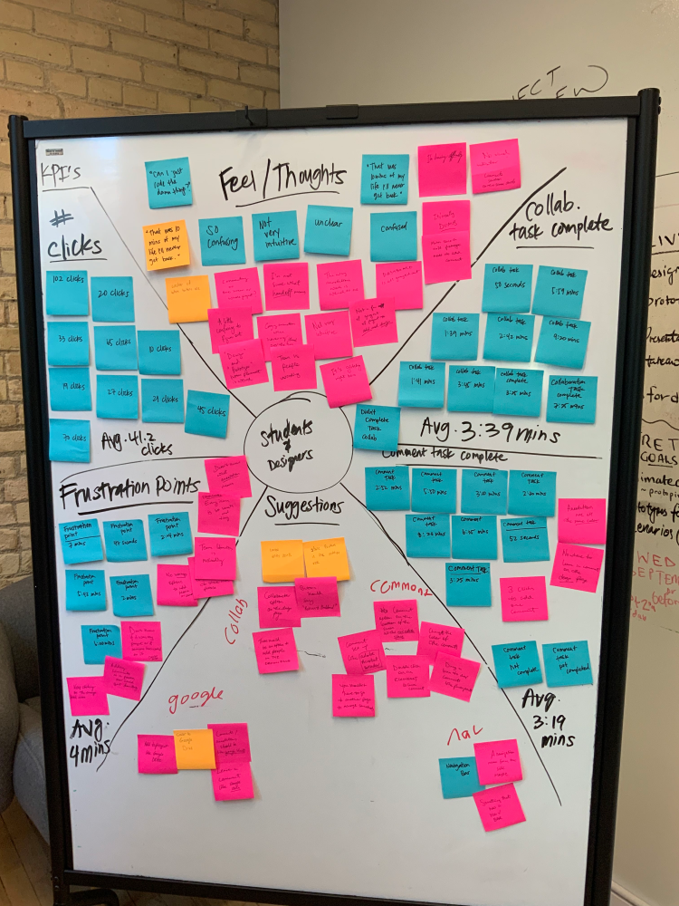
After completing the contextual inquiry, we then organized the research and knowledge gained by creating an affinity map that helped us organize the information into four different categories:
1. Suggestions
2. Frustration Points
3. Feels/Thoughts
4. Comment/Collaboration
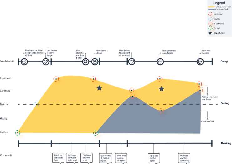
To understand how the users felt during the tasks, we documented their emotional states to truly understand their frustration, confusion and overall how they felt while completing.
A Journey Map is one of the best tools to understand how users feel.
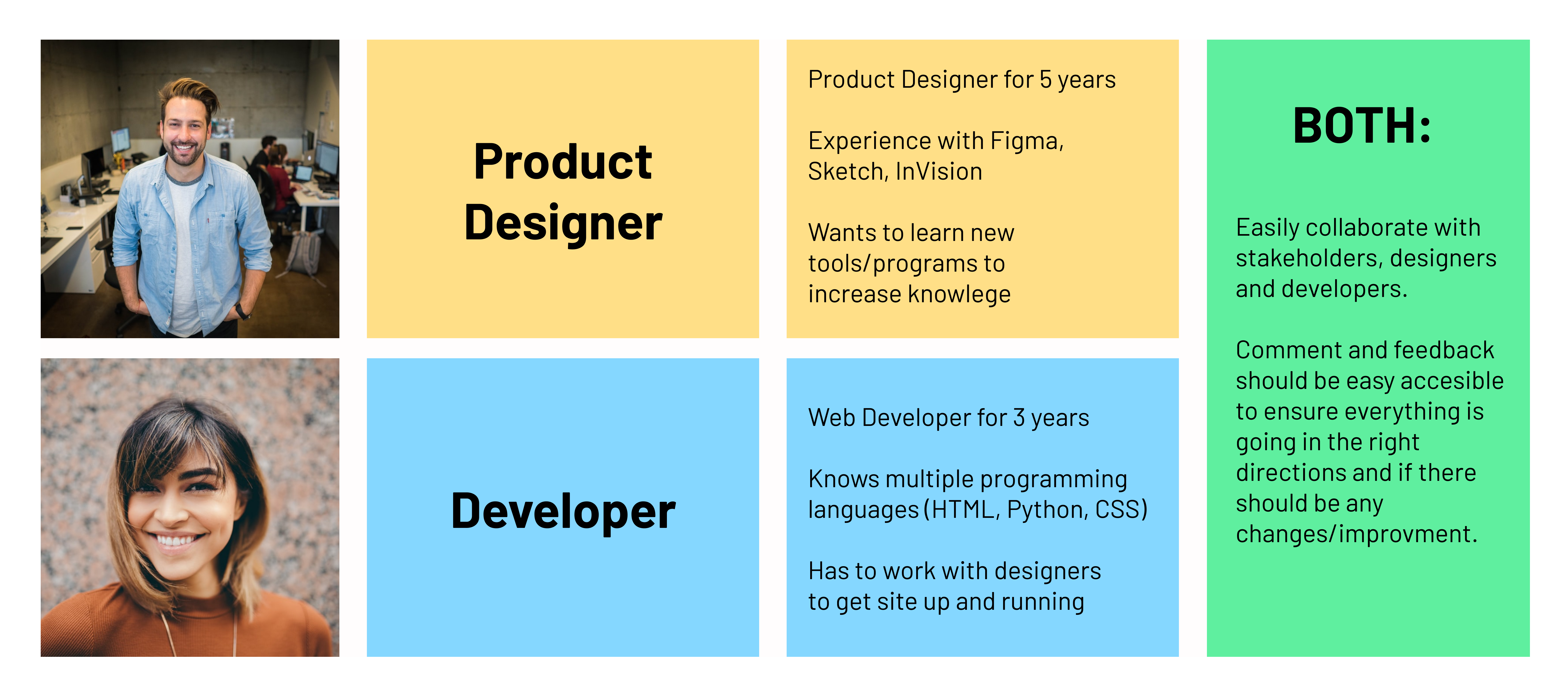
1. The UI of the dashboard and the design window to include:
1a. Sharing Option
1b. Comment Option
2. The header on the dashboard for easy navigation.
After completing thorough research of the current Marvel app's sharing and commenting feature, we were truly able to understand what changes can be made to the app in order to improve the experience
Before we started implementing our design ideas, we created a user flow to understand the paths the user might make when needing to add a collaborator or adding a comment.

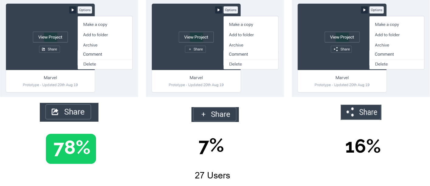
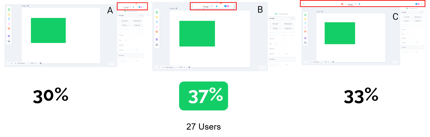
To have a better understanding of the user interface and which designs users prefer according to their preferences, we conducted three usability tests, testing navigation header, the share button as well as the design navigation bar.
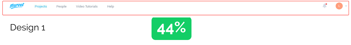
After conducting the usability tests, we wanted to test out our early designs and created a Mid-Fi Prototype to test the new efficient and intuitive designs
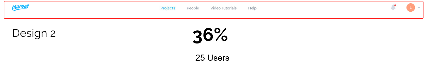
Once we completed the Mid-Fi Prototpye we wanted to test out our designs and see the difference in KPIs with the same users completing the same tasks.
10 Users, task completed on Current Marvel App:
1. Leave a Comment
2. Add a Collaborator
Since our KPIs showed a drastic improvement from the old Marvel design to ours, I'm sure you'd love to see our Hi-Fi wireframes as well as the final prototype. So be sure to click the link to the right and test it out yourself!
